Acctivate News
Built For

Updated Payment UX
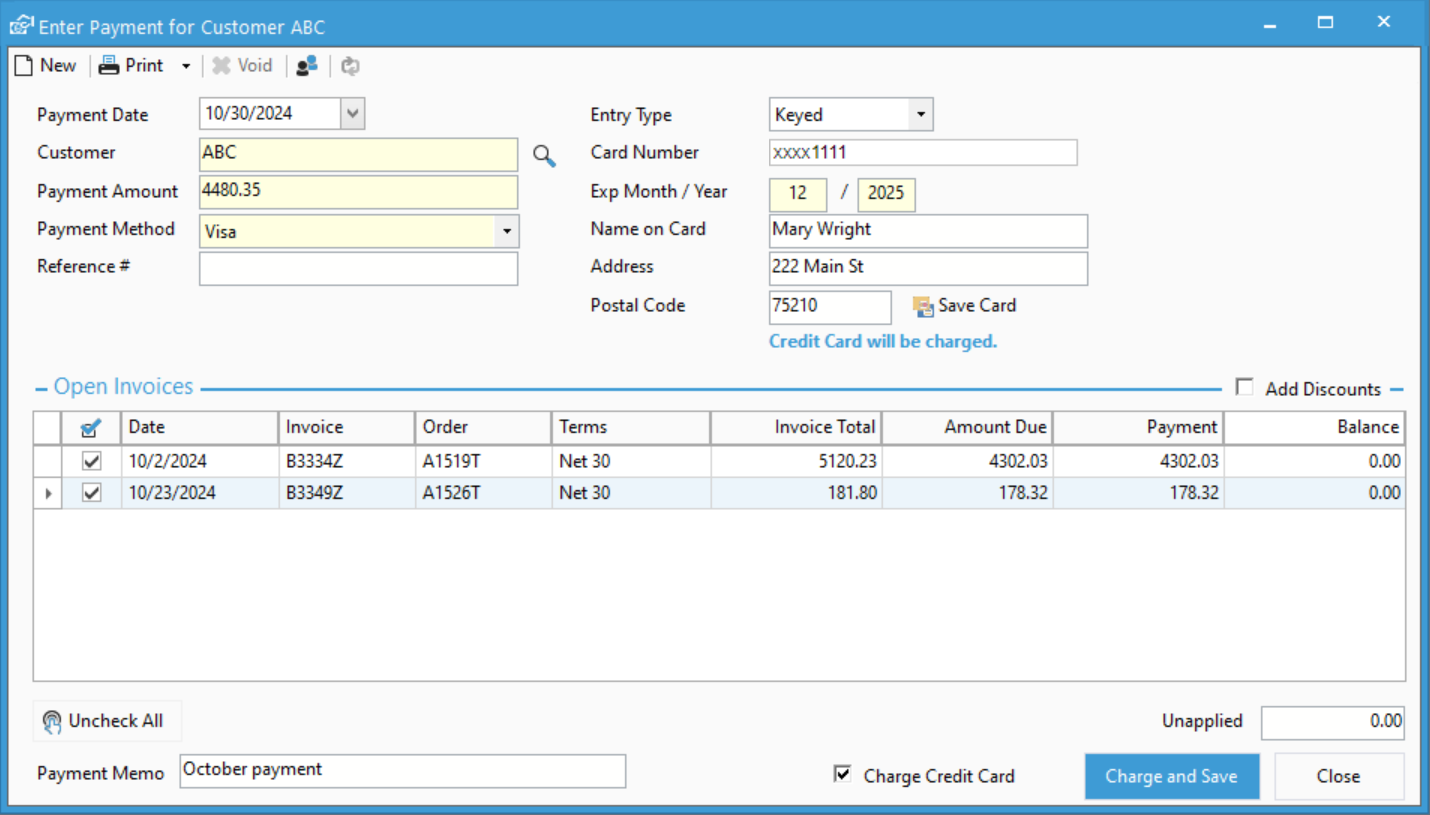
The Enter Payment window has been updated to provide a better experience when entering all types of payments.
Improved layout of fields
Common payment fields are displayed in the left side of the window, while the right side will show credit card or eCheck specific fields. Meanwhile, the Payment Memo and exchange rate fields have been moved to the footer of the window, allowing you to focus on the required information to process a payment.
Credit Card Entry Types
Companies that are integrated with Fiserv will also benefit from the ability to switch between keying in a credit card or selecting a Fiserv supported terminal to process a credit card. This allows you to easily process card present and card not present transaction, offering greater flexibility, accuracy, and security.

Quicker Edits
The Enter Payment window no longer requires clicking Edit to edit payment information or how it’s applied. Instead, immediately edit information in the window and simply click Save once you’ve made your changes.
Learn More
Watch the video below for more information about improved payment entry. Also, learn more about Fiserv, which together with CAI Acctivate, has set a new standard for accepting payments.
Check out our Enter Payment window documentation at docs.acctivate.com
Related Posts
-
Version 15 Now Available!
Acctivate Version 15 is available for download as a Preview! Be one of the first to get your hands on exciting new features and changes,…
-
Automated Sales Tax with QuickBooks Online
COMING IN VERSION 15 We’re excited to introduce a powerful new enhancement to Acctivate — our QuickBooks Online Automated Sales Tax (AST) integration. This new…
-
New Streamlined Edit Customer window
COMING IN VERSION 15 Acctivate’s redesigned Edit Customer window delivers a streamlined interface for creating and managing customer information. By removing read-only data — which…
Call us at 817-870-1311